Biography by Dominic Hofstede.
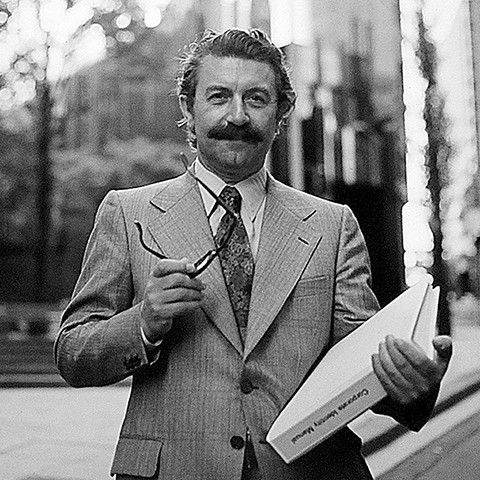
In a 1975 Design Australia profile titled ‘Design in Business’, Pieter Huveneers is pictured in a suit and tie, a corporate identity manual nestled under one arm, reading glasses in the other. Here, the image seems to say, was a designer unafraid to speak the language of industry, a positioning which differentiated him from many of his contemporaries. His innovative approach to identity design, which blended creativity with commerce, resonated loudly with corporate Australia. The resulting body of work left an impact on our visual culture which was profound, and enduring.
Born in Utrecht in 1925, Pieter Huveneers was just 15 years old when the invading German army occupied the Netherlands. Narrowly escaping capture, he spent a harrowing two years in hiding, finding shelter with kind-hearted farmers. The experiences of the war deeply affected the teenage Huveneers, instilling in him a lifelong empathy for others.
A natural affinity at drawing lead to a design course at the Arnhem Academy, selected because of its ‘wide application’. He graduated just as the war came to an end in 1945, and undertook his first corporate identity project for a flower show. ‘Flower shows are big business in Holland. I painted the signs for the exhibitions for two days and nights. Then I worked for the Dutch Industries Fair. I did a poster for them. I liked posters’.
A selection of his posters were exhibited at the 1951 Festival of Britain, catching the eye of Commander Edward Whitehead from Schweppes. He invited Huveneers to produce work for the beverage giant and the designer arrived in London in 1952, staying for almost 15 years. His burgeoning reputation grew through the striking hand-crafted posters and advertisements he created for brands including BOAC, British Railways, General Electric Company, ICI and Pepsi Cola. Of particular note were the designs he produced for the British Post Office which were to echo in his later work for Australia Post.
In 1966 Sies Numann, the entrepreneurial head of PR for Philips, lured Huveneers back to the Netherlands to work for the iconic Dutch company. Though relatively brief, his time there included refinement of the Philips logo, and he was flown to all corners of the world in his role as International Creative Director.
By the late 1960s, Huveneers’ gaze turned to Australia, selecting his new destination as it presented ‘an opportunity to go to a country with new horizons’. He arrived in Sydney in 1968. One of the first people he met, fortuitously, was Sim Rubensohn, the founder of advertising agency Hansen Rubensohn which later became McCann Erickson. Rubensohn knew of Huveneers through this connection to Philips, one of McCann’s earliest clients, and his significant influence within the upper echelons of power in government and industry opened many doors for the ambitious designer.
Huveneers initially worked from a space within McCann, swiftly attracting an impressive roster of clients. In 1970 he moved to his own studio at Milson’s Point where Huveneers Pty Ltd would remain for two decades.
In a period when Australian designers, and clients, were just beginning to embrace the discipline of corporate identity, Huveneers timing was impeccable. His pioneering approach, informed by his experiences in the UK and the Netherlands, encompassed aspects of behavioural psychology, business strategy and systematic design. ‘We do design systems, not just little symbols we stick on things. We cover as much of the commercial side as the design side and we become totally involved in the operation of a company, not just the graphics’.
It’s difficult to think of an aspect of Australian life untouched by Huveneers Pty Ltd. The practice undertook corporate identity projects for over 70 major Australian enterprises including ACI, Colonial Mutual Life, Dulux, Myer, TAA, Tooth & Co and the Bank of New South Wales, which was rebranded as Westpac (a portmanteau of Western Pacific) in 1982. Despite some public murmurings (its abbreviation ‘WPB’ was said to stand for ‘Waste Paper Basket’), the name, and iconic ‘W’ symbol originally designed in 1972, have endured, confirming Huveneers initial assessment that ‘it would have bite’.
A robust, memorable and above all, simple, symbol was at the core of Huveneers identity systems. A number of factors were considered in the symbol’s design including adaptability (it should suit all media), visibility (it should be capable of recognition irrespective of size or colour) and durability (it should be from elements which could ‘date’).
Perhaps the most challenging project undertaken by the studio arrived in 1975, when the Australian Government de-merged the PMG (Post Master General). Huveneers named the new entities Australia Post and Telecom, and began a ruthless rationalisation of the bloated internal processes at the PMG. Every detail was considered, right down to how a letter was typed, and folded; ‘this standardised method of training and presentation has been known to yield a 3% to 5% saving in typists’ time’. Like Westpac, the identities proved to be astute investments; Telecom was rebranded in 1993 and the Australia Post symbol remains in market today.
A team of around 25 sourced from all corners of the globe were responsible for delivering the work. Alongside full-time designers, Huveneers Pty Ltd employed specialists in communication planning, market research, industrial design, patent registration and business management. Amongst them was the renowned Swiss designer, Paul Buhlmann who worked with Huveneers between 1971–1974 before establishing his own practice, VisComDesign.
By the early 1990s, Huveneers turned to consulting, closing the studio after two prosperous decades. He spent an increasing amount of time at his cherished Blue Mountains property, The Ridge, tending to the garden, and his beloved animals. Painting became a renewed focus, often in the solitude of his studio, accompanied by the strains of a favourite jazz track. He eventually settled in Tasmania with his devoted partner Tanis, succumbing to Alzheimer’s after a prolonged struggle. He was 92. His remarkable legacy, still visible on the post boxes in every Australian city and town, lives on.